
Join us for a concise and inspiring conversation with Sandy Karman, a Jakarta-based graphic designer and poster artist. Renowned for his layered designs and bold typography, Sandy shares his creative process, sources of inspiration, and his vision for a distinct Indonesian visual identity.
1. Could you please introduce yourself and share what drives your passion for poster design today?
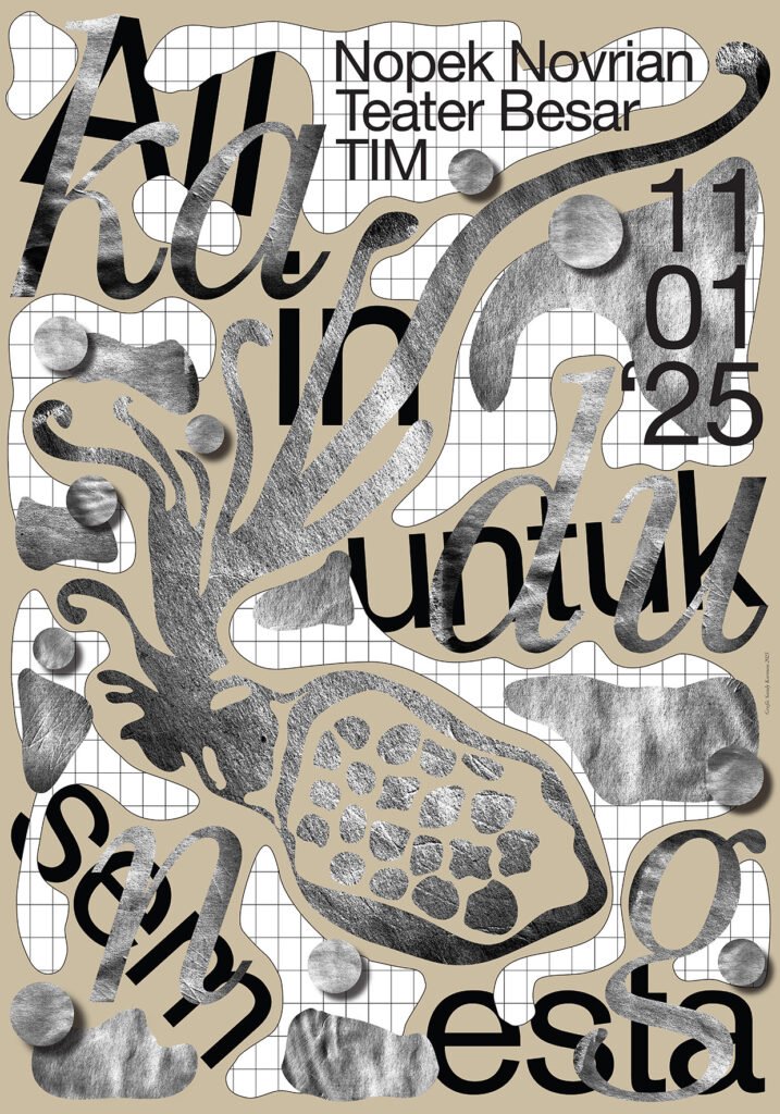
I am Sandy Karman. A bit about me: I am a graphic designer, poster artist, rug designer, and lecturer based in Jakarta. Born in 1983 in Jakarta, I graduated from Visual Communication Design at the Bandung Institute of Technology. I’m a bronze medalist at the Hong Kong International Poster Triennale and a Golden Bee Award Incentive Diploma recipient at the Moscow Global Biennale. I’ve worked for Total Design (Amsterdam) in 2004 and participated in in-residence workshops with Prof. Ahn Sang Soo and Kim Do-Hyung (Seoul), Makoto Saito (Tokyo), and Kan Tai Keung. I also gave a presentation of my work at AGI Open in São Paulo in 2015.
My poster works have been exhibited in La Fête du Graphisme (The Graphic Art Festival 2014 & 2016) in Paris, Echirolles Centre du Graphisme in France, and museums such as the Museum of Modern Art Toyama in Japan, the Poster Museum in Warsaw, the Academy of Fine Arts Warsaw, Poster Museum Lahti, Hong Kong Heritage Museum, Central House of Artists Moscow, New Tretyakov Gallery Moscow, multiple cities in the US & Canada in the United States Biennial, Vladivostok Design Week, as well as other thematic international graphic design exhibitions in Taiwan, Łódź, Seoul, Busan, Daegu, Tula, Shanghai, and Hungary.
Solo shows include A Poster: Sandy Karman Poster Exhibition at Designclopedia Jakarta and Sandy Karman: Tribute to Indonesian Heroes at Plaza Indonesia.
My drive for poster design today is simply that I can never not create it, even if I try. As you know, I live in a country and environment where poster culture and jobs are basically non-existent. So, to be able to do this for the last 18 years is beyond my imagination. I am truly, humbly, and overwhelmingly grateful.
2. In today’s fast-paced, digital-first world, where do you find inspiration for your poster designs?
I find inspiration mostly through two things. First and foremost, when I’m working. Ideas synthesize gradually and organically during the process, and it has always been the greatest joy to surprise myself along the way. Secondly, from the syntax of phrases or sentences I read and hear—they can be from movies, songs, or even comments on social media. Sometimes I just find them interesting; they stay in my head and spark the urge to turn them into something. They can be poetic, sarcastic, witty—whatever.
3. Is there a design trend in 2025 that particularly excites you? How are you approaching it in your work?
I’m currently in the zone of mixing bold and graphic typography with freeform 3D typographic renders. As you can see, I have always loved the interplay of different textures and layers in my design. And I feel like 3D typography is currently trending.
4. With people being bombarded by visuals every day, how do you make your posters stand out?
We just stay true to who we are. We can look to the right and look to the left—see what other people are doing—but never lose our sense of focus, vision, and character. We adapt to the ever-growing and dynamically changing trends, but we just have to be ourselves at the core.
5. What’s your method or trick for blending typography, imagery, and color into a cohesive and powerful poster?
My work mostly contains layers (and sometimes textures), which means I rarely create fully flat vector-only elements. Blending the typography, imagery, and color into a cohesive body of work is, I think, a matter of personal style and point of view. In other words, when you feel like it’s right. It’s sort of hard to explain. Hahaha
6. How do you create posters that resonate with a diverse, global audience from different cultural backgrounds?
By creating pieces of work that go along with the universal agreement on what good graphics are, yet at the same time, maintaining a sense of personal character. Especially with the rise of social media and curatorial accounts, there’s a universal visual “agreement” on what good graphics look like—a universal visual graphic system, taste, and trends.
There are positive and negative sides to this, though. The positives are that people around the world are easily exposed and can “learn” what international good design is, especially in places where contemporary graphics are not part of daily regular consumption. The negatives are that design nowadays tends to be more formulaic and generic. There are many amazingly talented poster designers with great techniques and iconic characters whose work is not popular simply because their style is not currently “trending.
7. Are you integrating new technologies like AI or interactive elements into your poster designs? If so, how?
Yes, AI really helps me in terms of giving me other points of view and explanations on subjects. As I said before, I am drawn to the syntax of words. Sometimes AI can come up with phrases or sentences that become the starting point of the process.
AI is very generic and mainstream in terms of visuals and aesthetics, but in the realm of writing, AI is surprisingly sharp. Sometimes I ask for some philosophical quotes, and it comes up with really profound answers.

8. What steps do you take to ensure your posters are inclusive and accessible to people with different abilities?
In what sense? As a project or retail selling of a poster? Since I live in an environment where poster culture is literally non-existent, 95% of my work is for projects. Retail is only for those who know me personally and my format/style of work. As long as we share the same vision on how we can make good work, I’ll work with everyone.

9. What’s the boldest or most experimental design project you’re currently working on?
Probably my Manifesto 100—celebrating 100 years of the Surrealist Manifesto, with a surrealistic typographic approach inspired by my favorite surrealist, Yves Tanguy, using forms inside a window inspired by another surrealist icon, René Magritte’s ambiance.
Not exactly a piece of graphic design we’re used to seeing. I still don’t even know how people will take it, like it, or anything.
10. If you had the chance to redefine the role of poster design in the future, what would you create or change?
Very deep question. Poster designers have the utmost power in defining the true meaning of problem-solving through visual communication, and are a true embodiment of why the profession of graphic design was created in the first place.
Coming from Indonesia, I dream of the existence and realization of a lived, Indonesian visual language identity—a subject that’s been in my head for the last 18 years—and for it someday to be accepted internationally. For example, like the Japanese visual language or the Iranian visual language. Chinese and Korean visual languages have been growing rapidly over the past few decades.
Because if done correctly, the integration of Western design roots with local Southeast Asian ethnic elements could be magnificent. Well, one can dream.
Interview by: Behnam Raeesian

