
Design today moves fluidly between disciplines—from experimental typography and generative systems to global communication platforms that shape how people understand essential information. For Kyujin Han, these seemingly distant practices are connected by a single guiding principle: purpose.
A graphic designer and graduate of the School of the Art Institute of Chicago (SAIC), Han’s work spans both experimental design research and large-scale communication projects. As the Lead Graphic Designer at Story Leaf, a global health education nonprofit, he creates visual content that translates complex medical knowledge into accessible information, reaching millions of people worldwide. Alongside this mission-driven work, Han continues to pursue independent projects that explore typography, generative systems, and conceptual design.
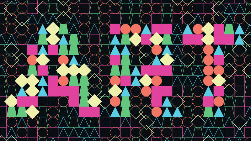
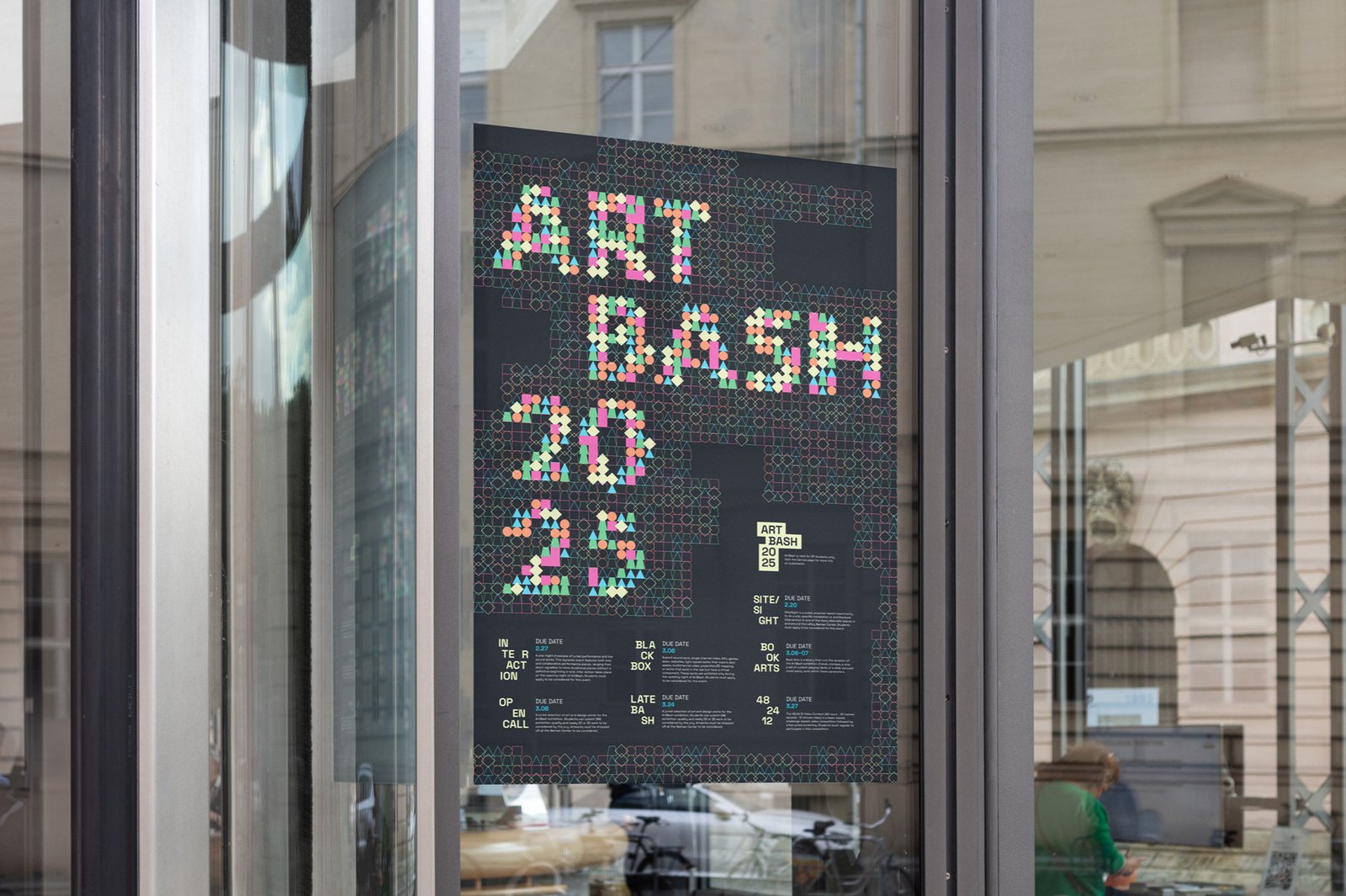
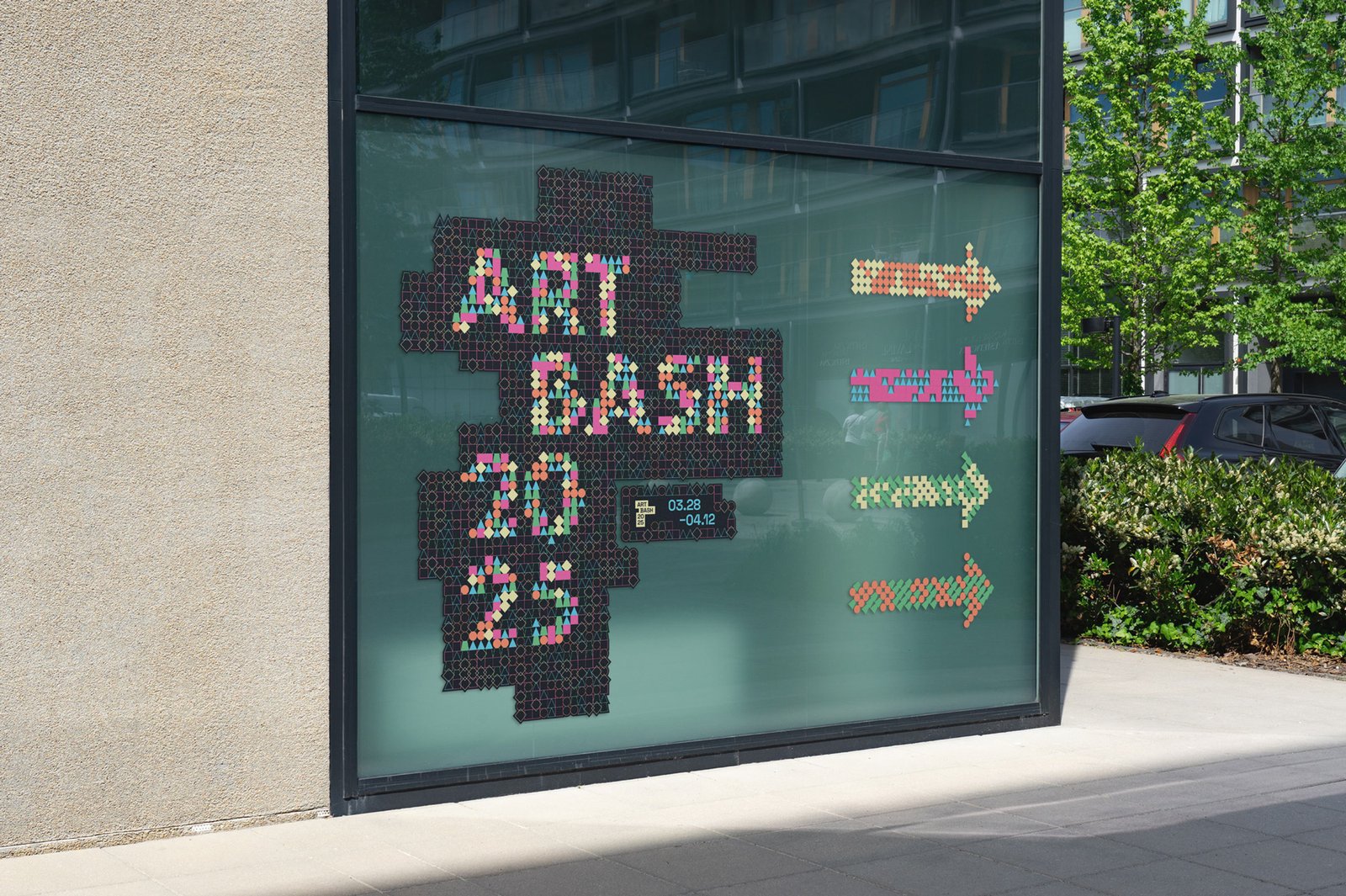
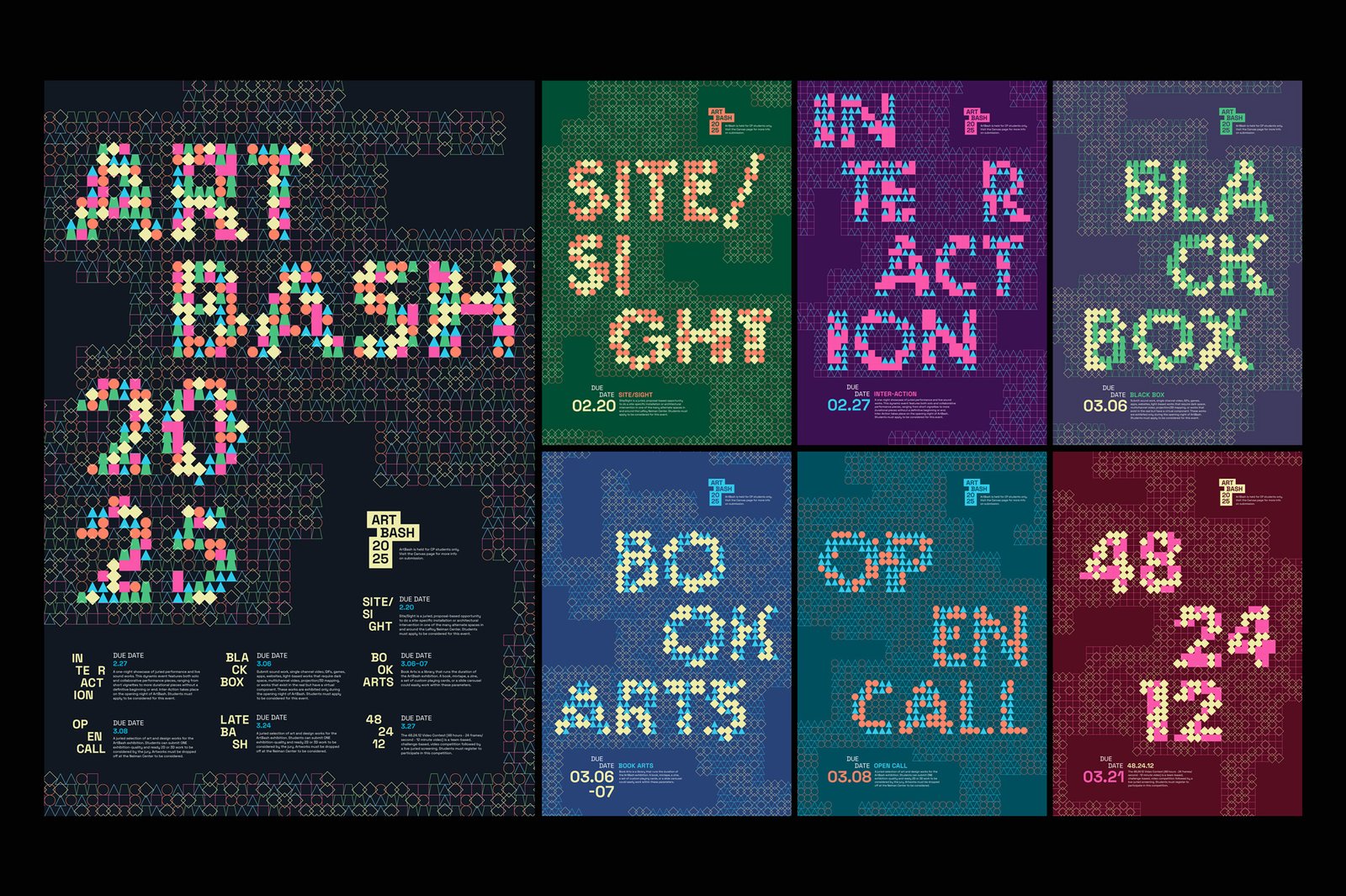
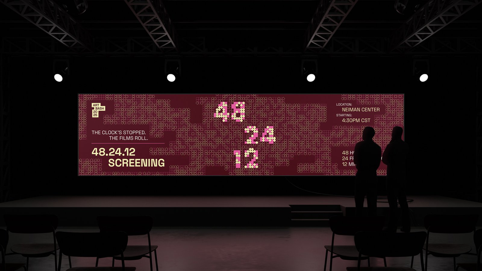
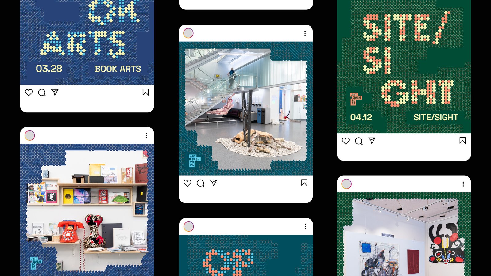
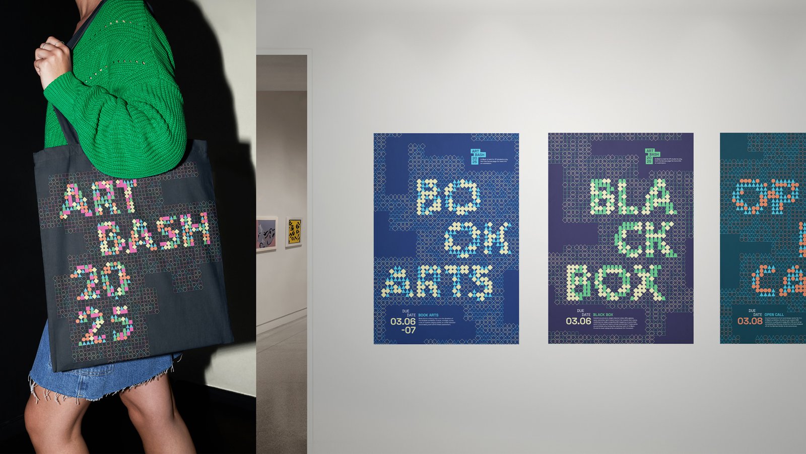
One such project, the ArtBash 2025 identity system, reflects the uncertainty and discovery experienced by first-year art students through distance-dependent typography—letterforms that shift from fragmentation to clarity as viewers step back. Built using creative coding tools, the project recently received international recognition, including awards from the Design MasterPrize and Creative Communication Awards, as well as finalist recognition in the Communication Arts Typography Competition.
In this conversation with CooterMag, Han reflects on purpose-driven design, the balance between experimentation and clarity, and the ethical responsibility of visual communication in an increasingly interconnected world.
Your practice spans experimental, concept-driven typography and large-scale public health communication. How would you define the core philosophy that connects these seemingly different bodies of work?
At the core, I believe design should be driven by purpose. This means creating with intention to solve real problems and create meaning, rather than just for aesthetics. What interests me most is exploring how that belief holds across completely different contexts: from designing an identity system for an institutional exhibition that represents the emotional and creative journey of first-year students to creating accessible health education content for a global nonprofit reaching millions. The contexts couldn’t be more different, yet both ask the same fundamental question: who is the design for, and does it create something meaningful for them?
You’ve described your work as purpose-driven. What does purpose-driven design mean to you, and how does it guide your decision-making process across projects of very different scales?
Purpose-driven design means that every creative decision traces back to a clear intention. It’s the difference between making something that looks right and making something that works meaningfully. Before I think about aesthetics, I ask: what does this design need to communicate, and for whom?
That question plays out differently depending on the scale and context. With ArtBash 2025, I was selected to design an identity system for an annual exhibition celebrating the creative journey of the first-year students in Contemporary Practice, an interdisciplinary foundation course at the School of the Art Institute of Chicago (SAIC). Purpose guided me toward an experimental solution: distance-dependent typography that embeds the student experience and growth directly into the visual system. The design needed to feel true to what these first-year students actually go through, so the concept had to carry that emotional weight.
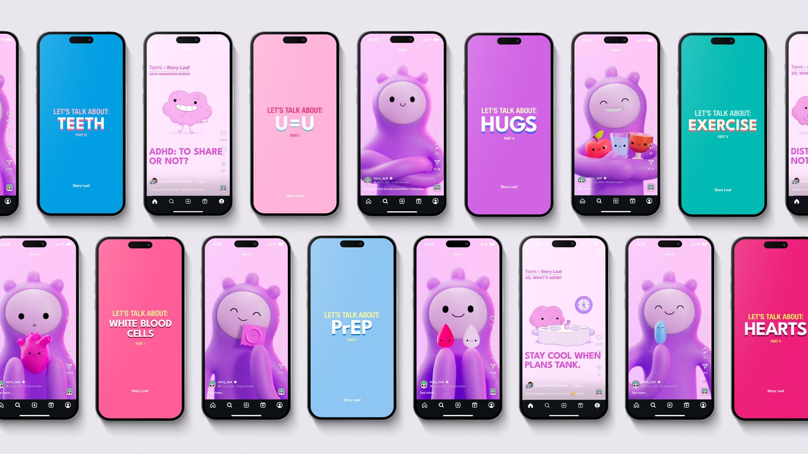
At Story Leaf, a global health education nonprofit where I lead graphic design, I create visual content that makes critical health information accessible to millions. This includes infographics, illustrations, and animated series across social media platforms, all designed to reach Gen Z and Millennial audiences worldwide. Purpose means something more immediate here: health information needs to be approachable and friendly for people scrolling through social media, so every visual decision is weighed against whether it helps or hinders that goal. The audience is global, diverse, and needs to understand critical health information quickly—there’s no room for ambiguity.
What stays constant across both is that purpose acts as a filter. When I’m unsure about a creative direction, I come back to what the design is actually trying to do. That clarity makes decision-making more grounded, even when the work itself is experimental or uncertain.

The identity for ArtBash 2025 explores generative systems and distance-dependent typography, where legibility shifts depending on proximity. Could you elaborate on the conceptual thinking behind this system and how clarity becomes a metaphor within it?
ArtBash 2025 is an annual exhibition celebrating first-year students in Contemporary Practice (CP) at SAIC. Its identity, which I created, embraces students’ uncertainty and exploration, using letterforms whose legibility shifts with distance to mirror clarity gained over time. The conceptual foundation came from reflecting on my own experience as a first-year student in that same program. At the time, it felt incredibly disjointed—jumping between different media, exploring unfamiliar tools, not seeing how anything connected. But looking back as a senior, I could clearly see how those seemingly random explorations had shaped my entire artistic practice. That realization became the heart of the project: clarity isn’t something you have in the moment; it’s something you gain through distance and time.
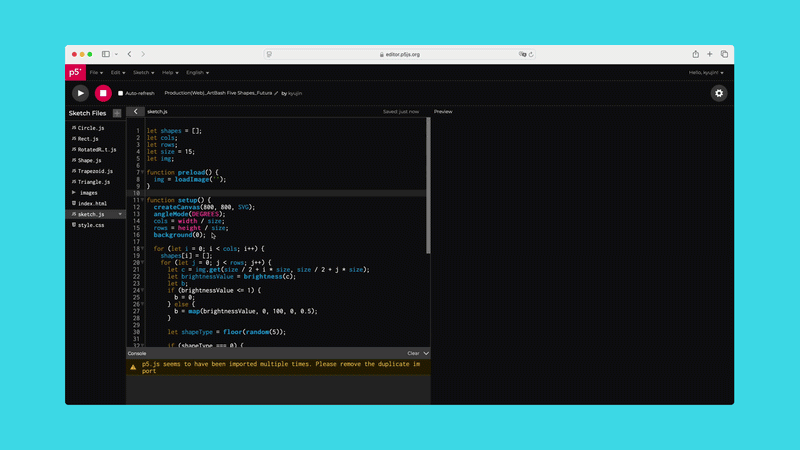
I wanted to translate that experience into the visual system itself. The distance-dependent typography works as a direct metaphor: up close, the letterforms appear fragmented and unclear, but as you step back, they resolve into legibility. It mirrors exactly what students go through: confusion in the present, coherence with perspective. The viewer physically experiences the shift from uncertainty to understanding. The choice of design tool, which is a creative coding tool called p5.js, was conceptually appropriate because it was one of the tools I learned during CP itself. Using curriculum materials to design the visual identity made the design process itself a reflection of the program. By using p5.js to build the system from geometric building blocks, I could control that threshold between abstraction and clarity, making the metaphor functional rather than decorative.
In your generative design work, systems often replace static forms. How do you balance structure and unpredictability in coded typography while maintaining conceptual coherence?
The balance comes from understanding that a generative system needs clear rules to produce meaningful variation. With ArtBash 2025, I started by defining the structural foundation: a set of five geometric shapes that would serve as the building blocks for all the letterforms. That constraint gave the system its coherence; no matter how the shapes recombined, they always felt like they belonged to the same family.
Within that structure, p5.js allowed for controlled unpredictability. I created code that could manipulate how the shapes scaled, repeated, and arranged themselves to form different letters, testing variations quickly to see what worked. The tool let me iterate through possibilities much faster than traditional design software would allow, but what kept it coherent was returning to purpose. Every variation had to serve the same conceptual goal: pushing legibility while maintaining the metaphor of gaining clarity through distance. Even when the system produced unexpected results, I could evaluate them against whether they supported or undermined that central idea.
Your independent experimental work and your role at Story Leaf operate in dramatically different contexts—one within artistic exploration, the other within global health communication. What fundamentally changes in your design approach between these contexts, and what remains constant?
What changes most is the tolerance for abstraction and experimentation. With ArtBash 2025, I could push boundaries and embrace visual uncertainty because the project itself was about that feeling. The design could challenge legibility as long as it served the concept. At Story Leaf, there’s no room for confusion. Health information needs to be immediately clear and approachable, so every visual decision prioritizes accessibility over experimentation. The experimentation happens behind the scenes, testing numerous iterations to achieve visual clarity.
The difference in approach also stems from my understanding of the audience I am trying to communicate with. ArtBash was designed for a specific community: students and faculty of an art school who understood the CP context and could appreciate the conceptual layers. At Story Leaf, I’m designing for millions of people across different cultures, languages, and levels of health literacy. The visual language has to work universally, which means simplicity and directness become essential.
What remains constant is the design thinking process itself. Whether I’m working on ArtBash or a health campaign, I always start the same way: by understanding the purpose, context, and audience before making any creative decisions. The contexts demand different solutions, but that underlying process, designing with clear intention and grounding every decision in what the work needs to accomplish, stays the same.
At Story Leaf, you work at the intersection of design and medical expertise. How do you translate complex clinical information into accessible visual narratives without compromising scientific accuracy?
The process starts with collaboration. I work closely with medical professionals, particularly Dr. Edsil A. De Ocampo, MD, Hospitalist and Medical Director of Recruitment at John Muir Medical Group, who reviews all our content for accuracy. Before I touch any visuals, I need to understand the medical information deeply enough to know what’s essential and what can be simplified without losing meaning. That often means reviewing medical journals and having conversations with physicians to clarify which details are critical and which are just added complexity.
The translation happens through careful curation and hierarchy. Medical experts naturally want to share as much information as possible because it all feels important. My role as a designer is to identify the core message and understand how our target audience will perceive and retain it. Then I built the visual narrative around that understanding. It’s about finding the balance between what’s medically comprehensive and what’s actually digestible for someone scrolling through Instagram or TikTok.
Scientific accuracy isn’t compromised in this process; it’s just reframed. Instead of presenting information the way a medical report would, I’m translating it into a format that feels approachable and friendly while keeping every fact physician-vetted. The visuals serve as a bridge between medical expertise and public understanding.
Designing health education content that reaches millions carries a different type of responsibility compared to experimental typographic work. How do you navigate the ethical dimension of scale and impact in your practice?
The responsibility is something I think about constantly. The art and design community embraces experimentation and abstraction, where pushing the boundaries of clarity can be part of the concept itself. At Story Leaf, the stakes are different when health information isn’t clear or is presented in a way that discourages someone from seeking care or understanding their options, with real consequences.
I navigate this by prioritizing both accuracy and accessibility at every stage. Every piece of content is physician-vetted to ensure scientific accuracy, but accuracy alone isn’t enough. The information also needs to be understood by the people who need it most. This dual responsibility, getting the facts right and making them accessible, shapes every design decision, from visual language to information hierarchy.
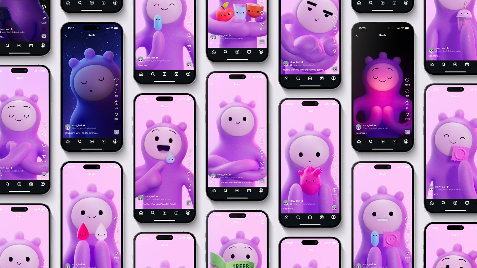
Ethical responsibility also fundamentally shapes our design choices. “Living Well” is an animated health education series we created for social media, featuring Jamie, a character who shares essential health tips and habits for young adults. We intentionally designed Jamie to be something other than human, not tied to any specific race, gender, or nationality. This wasn’t just an aesthetic choice; it was an ethical one. We wanted people from all backgrounds to see themselves in Jamie’s story, ensuring our content could resonate globally without excluding anyone. These kinds of thoughtful decisions, from character design to visual language to how we structure information, are what allow the series to reach millions across different cultures and languages. The ethical dimension isn’t just about getting the facts right; it’s about ensuring the design itself removes barriers rather than creates them.
You often describe design as a form of translation and bridge-building. Can you expand on how you see the designer’s role in mediating between specialists and the public?
I see the designer’s role as standing in the middle and advocating for both sides. Specialists—whether they’re medical professionals or faculty members—have deep expertise and want to share as much of it as possible because they understand how valuable that knowledge is. The public, on the other hand, needs information that’s immediately accessible and relevant to their lives. Both perspectives are valid, but they don’t naturally speak the same language.
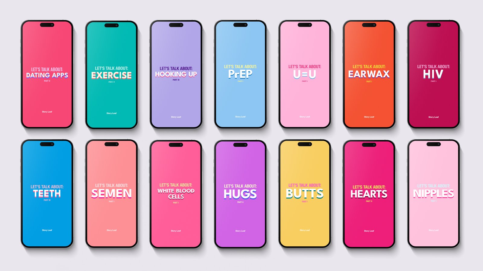
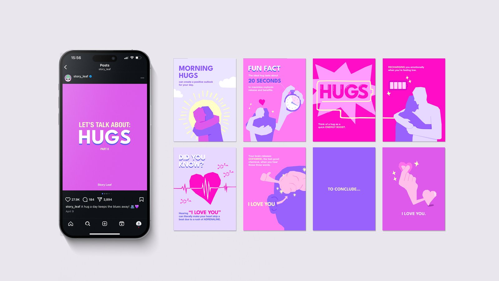
The designer’s job is to translate between those two worlds. That means understanding the specialist’s information deeply enough to know what’s essential, but also understanding the audience well enough to know how they’ll actually receive and use that information. It’s not about dumbing things down; it’s about finding the right entry point. At Story Leaf, I work with physicians to distill complex research into visual formats that feel approachable on social media. The ‘Let’s Talk About’ series I created at Story Leaf, an illustrative health education series that tackles often-ignored health topics in a clear and friendly way, is an example of this translation. I created a deliberately graphic style that lets me balance the visual weight between the information and the illustrations, keeping the visuals engaging without over-illustrating or pulling attention away from the essential health information. Once I finalize the illustrations, everything is reviewed and vetted by physicians before release, ensuring the translation is accurate while remaining accessible.
What makes this role meaningful is that both sides benefit. Specialists get their knowledge into the hands of people who need it, and the public gets access to information that might otherwise feel out of reach.
How does working across such different audiences—students, award juries, global health audiences—shape your understanding of clarity, legibility, and engagement?
Working across different audiences has taught me that clarity isn’t universal—it’s contextual. What feels clear to one audience might feel oversimplified or overcomplicated to another. With ArtBash, clarity could be layered and earned. Students and faculty engaged with the conceptual depth because they had the context to understand it. The distance-dependent typography required them to physically step back and experience the shift from fragmentation to legibility, and that effort was part of the design’s meaning.
At Story Leaf, clarity needs to be immediate. I’m designing for millions of people scrolling through social media, people who might not have medical backgrounds, who speak different languages, who need to understand critical health information in seconds. There’s no room for ambiguity or layers that require decoding. The visuals have to work universally and instantly.
What stays consistent is understanding who I’m designing for and meeting them where they are. With art students, that means respecting their ability to engage with complexity. With a global health audience, it means recognizing that they’re coming to the content with different needs and different levels of familiarity with the subject. The goal isn’t to simplify or complicate for its own sake—it’s to find the appropriate level of depth and accessibility for the people you’re actually trying to reach.
In projects like ArtBash 2025, typography becomes a metaphor for growth and evolving perception. Do you see conceptual depth as essential to meaningful design, even when the end goal is accessibility?
I do think conceptual depth matters, but it doesn’t always need to be visible or explicit. With ArtBash, the conceptual layer was central because the project was about representing an emotional and creative journey. The metaphor had to be embedded in the design itself for it to feel authentic. Presenting that concept to the audience was essential. But at Story Leaf, the conceptual work happens behind the scenes. Because the audience needs to understand the information clearly and immediately, the conceptual depth isn’t designed to be visible to them.
What makes design meaningful isn’t whether the concept is visible—it’s whether the design was made with intention. Even when accessibility is the primary goal, there’s still conceptual rigor involved in deciding what to prioritize, how to structure information, and what visual language will resonate with the audience. That thinking might not be something people consciously notice, but it’s what separates design that truly works from design that just looks nice.
So yes, conceptual depth is essential, but it serves different purposes in different contexts. Sometimes it’s the message itself, like with ArtBash. Other times, it’s the foundation that allows accessibility to function effectively.
How do you personally measure the success of a project—through recognition, reach, clarity of concept, social impact, or something else?
The first thing I look at is whether what I was trying to communicate was successfully delivered to the audience I was trying to reach. With ArtBash, success meant the concept resonated with the people it was designed for—first-year CP students and faculty who would see themselves in it. When the design was voted as the identity system to represent ArtBash 2025 by that exact community, it confirmed that the message had landed as intended. They understood it, which was the whole point.
At Story Leaf, success follows the same principle. Our health media campaigns have reached over 150 million globally, and more importantly, we’ve gained their trust. People share personal health concerns with us, ask where to get tested, and seek out resources. They see our content as a safe space, which allows us to guide them to the health resources they actually need. The content isn’t just being seen—it’s helping people make better decisions about their health and improving lives, which is what we set out to do.
Recognition from prominent industry organizations matters, too, and I’d be lying if I said it didn’t feel validating. ArtBash received the Creative Communication Award Best of Best, won two Design MasterPrizes, and was named a finalist in the Communication Arts Typography Competition. Story Leaf’s efforts have received recognition and support from organizations like AIEP, a philanthropic Brazilian non-profit that tackles environmental, educational, health, and human rights issues, and Sustained Health Initiatives of the Philippines (SHIP), a non-profit dedicated to providing high-quality, affordable, and stigma-free HIV and primary healthcare. This recognition reinforces that the communication was successful and motivates me to know that my design philosophy is headed in the right direction.
Looking ahead, how do you envision the evolution of purpose-driven design in a world increasingly shaped by generative tools, AI, and mass communication?
I think purpose-driven design becomes even more critical as these tools become more accessible. Generative tools and AI can produce visually compelling work at scale, but they can’t determine what should be made or why it matters. That’s still a human responsibility. Without purpose being the driving force, the risk is that we end up with a design that looks polished but doesn’t actually solve problems or create meaningful communication.
But I don’t see that as inevitable. I see the future of purpose-driven design as a constant negotiation: using new tools to expand reach and efficiency while staying grounded in the fundamental question of what the work is trying to accomplish and whether it’s doing that meaningfully. The technology will keep evolving, but the need for designers who think critically about purpose and communication won’t go away. If anything, it becomes more important.
Connect with Kyujin Han
Website: https://kyujinhan.xyz
Story Leaf: https://www.instagram.com/story_leaf/
